

This post is a few weeks late because we went on vacation and then had the crazy oh we are back from vacation and need to catch up on everything week. I typically really need a vacation after recovering from vacation, man it is tiring! But I’m back and this week I wanted to talk about how to mix different frames in your displays but still keep it elegant. This is great for those that really like building a gallery over the years vs filling one space all at once. Plus it gives things a more lived in feel I think vs a more traditional gallery wall of all the same frames. In an upcoming post I’ll also cover mixing frames informally for a very casual look. So if you have a box full of small frames that don’t match and need advice for those stay tuned!
The key to mixing anything is to make it look put together and not like a hot mess. If you looked closely at my last post about my staircase gallery you would see this was a great example of mixing different frames but still having a cohesive look. There are a couple things that really make that display work and look elegant but casual at the same time.
1. Use similar color toned frames! This means either all black, all white or all wood tones. Remember they don’t have to be the same frame style but a display of all black frames will look put together vs a mix of black, white and wood which will look like a hot mess. I chose white and cream for our staircase display, the tones are very similar in the frames I chose so they work well together. With wood tones it can be a bit more tricky. Personally I would not mix finished wood frames and rustic unfinished frames in one display. I’d also be careful about mixing light and dark tones. It’s personal preference but I would probably group my wood frames into similar color shades and finish.

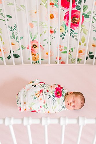
2. Mat your images! Not everyone will agree with me but I think a matted image looks much more polished than a plain framed image. It’s like that accessory that just ties together your favorite outfit! Plus the matting will be a cohesive element for your unmatched frames and images. I prefer white mats because I think they look elegant and set off any image, I’ve also seen colored mats that look really nice with specific images. However you choose to mat make sure for this type of display they all match. Different frames plus different mats = hot mess. Remember we want casual elegance not hot mess, ladies you know how fine the line is between these two :). Below is one of my favorite newborn session photos in a gorgeous double white 8×10 mat, all I need is the perfect frame!

3. Keep the tones in the photos similar! My style for clothing and decor is light, bright and airy and that translates over to our family photos. Our staircase display mainly consists of photos taken in our home from our boys newborn sessions by Marta Locklear. I’ve also mixed in photos of the boys I’ve taken as they’ve grown and for those sessions I make sure to dress them in lighter colors and the background is bright and consistent with the other images. This means they all work really well for our display. Now let’s say you are opposite of me and you love dark and moody, that is cool too! As long as you keep that consistent in your display it will look cohesive. Start mixing pastel with dark and moody in one display of mixed frames and you start getting into hot mess territory.
4. Darker on the bottom! After I wrote tip 3 I ran upstairs to grab a Peabody and Sherman coloring book for my oldest (typical work at home mom bribe) and took a quick look at our wedding photo in my staircase gallery. My husband is a Marine and wore the traditional dress blues, dark jacket and dark pants. Definitely not the light and airy look I typically like for my photos but he looked darn handsome! So that leads me to and added tip, darker on the bottom. If you have an image with darker tones that you love and want to display you can totally follow the rules above and then make sure it is closer to the bottom of your display. Darker colors tend to feel more heavy so if you put them at the top the display feels weighed down, if you put them at the bottom they are more pleasing and have more of an anchoring the display feel. I did this with our wedding photo in the staircase gallery, it is at the very bottom right corner and kind of starts the display. As you go up the images are lighter and brighter. I’ve also done this with a display in our bedroom I’ll talk about in another post.
So these are my tips for a casual but elegant photo display and how to avoid a hot mess on your walls!

Check back each Wednesday for the next installment in this series – Decorating Your Home with Photos
In the series:
Why?
My Staircase
Mixing Frames – Formally
My Hallway
Mixing Frames – Informally
My Family Room
Displaying Your Iphoneography
My Foyer
Hanging Your Display
My Master Bedroom
Frames vs Canvas
My Nursery
Evolution of your Photos
My Landing
Traditional vs Lifestyle
Wall Display Ideas
P.S. – Not sure if you can walk that fine line between hot mess and simply chic? That’s okay I would love to help guide you and together we can create the perfect display for your space! Contact me today to schedule your next portrait session.
Melissa Arlena is an award winning lifestyle newborn photographer in Charlottesville and Richmond, Virginia who has earned her Master Photographer Certification from NAPCP in maternity, newborn and family photography. Her natural and simple work has been featured in magazines and online blogs worldwide. She has been named Best Maternity and Newborn Photographer in Richmond and Charlottesville, VA in 2024.
